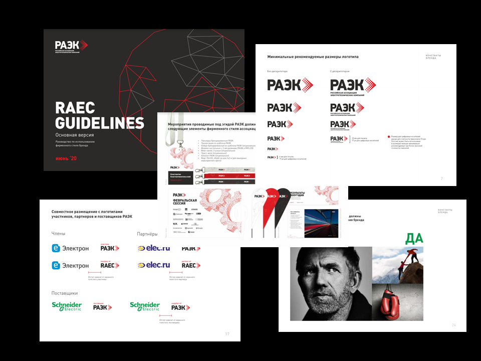
RAEC presented a new corporate identity
The brandbook has incorporated the 8-year history and style of the Russian Association of Electrotechnical Companies.
The guide is a set of materials aimed at different target audiences: internal and external.
Strength, integration, synergy, manufacturability, leadership became the basis for the formation of the Association's style.
White, red, black, and graphite-steel shades form the corporate colors of RAEC.
The recognizable logo of the Association has retained its features, but has been reinforced with a number of stylistic changes.
The set of materials on corporate identity is divided into categories:
• Employees
The projects of the Association are reflected in the design of forms for various kinds of documents and templates: Unified database, University, Center for Analysis and BI and others.
• The RAEC participants
We are strengthening the connection with the members of the Association by new means - through design and stylistic elements.
• Suppliers and partners
Partnership, cooperation, exchange of experience are the fundamental elements of RAEC, which is reflected in the corporate identity of the Association and materials prepared for the partner companies.
A complete set of materials on the RAEC corporate identity is available at the link.